Project Summary & Goals
Jerry’s Equine Dental Tools is a specialized ecommerce brand focused on equine dental professionals. The existing website had grown cluttered over time, with outdated visuals, inconsistent style guide usage and a confusing navigation structure.
The goal of this redesign was to simplify the experience, modernize the look and feel and make the site easier for practitioners to explore tools, understand options and complete purchases with confidence.
- Simplify product discovery across multiple categories and tool types.
- Improve mobile usability for on-the-go professionals.
- Align visuals and messaging with the broader MAI Animal Health brand.
- Surface key products and education without overwhelming the user.
Key Pain Points
Before the redesign, users struggled to quickly find the right tools or understand the differences between similar products. The navigation wasn't helping anyone shop and product pages were dense with information, but not always structured for quick scanning.
- Category structure didn’t match mental models of practitioners.
- Outdated visuals weakened trust in a highly specialized product line.
- Limited emphasis on flagship tools and bundles.
- Inconsistent content made comparisons and decisions harder than necessary.
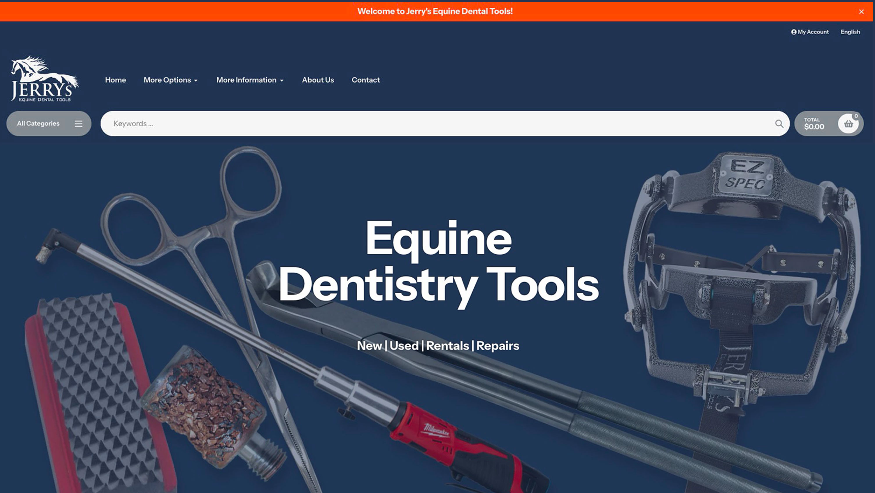
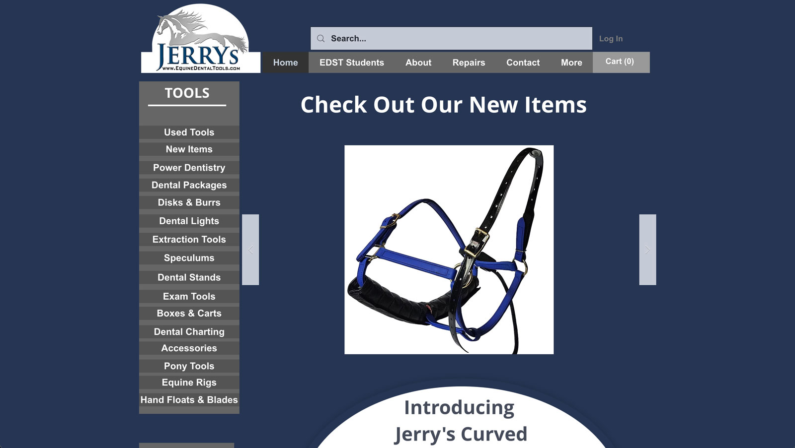
Before & After Homepage
The previous homepage was dense and visually dated, making it harder for practitioners to quickly understand what Jerry’s offers. The new layout simplifies the structure, clarifies calls-to-action and puts key product paths front and center.
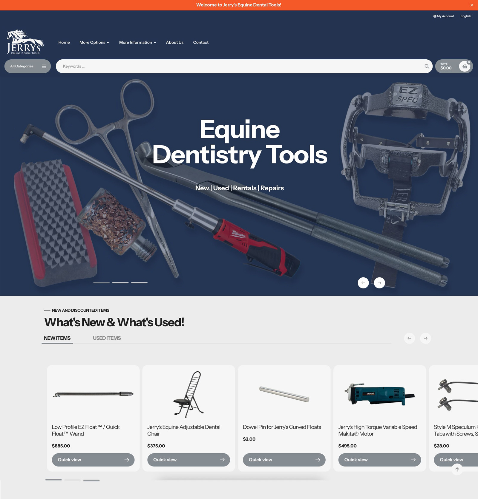
Designing a Clearer Journey
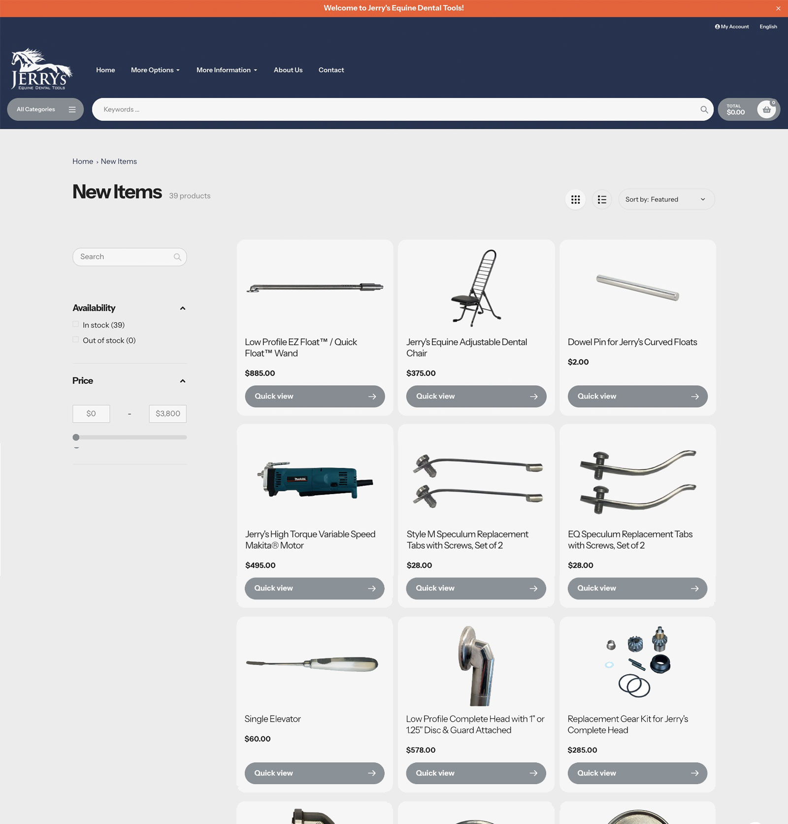
I kept the overall structure aligned with how equine dental professionals were already used to browsing the site—by tool type—but focused on cleaning up how those options are presented. Categories were alphabetized, overlapping items were consolidated, and the main menu was reduced to the essentials so users can get to the right tools faster without feeling overloaded.
- Alphabetized product categories to make scanning and repeat visits more intuitive.
- Consolidated overlapping or low-value menu items to reduce visual noise.
- Clarified category groupings so related tools live together instead of being scattered across the menu.
Modern, Focused, Professional
Visually, the redesign brought Jerry’s into alignment with a more contemporary, trustworthy ecommerce aesthetic. I used clean typography, simplified color usage and consistent product photography treatments to keep the focus on the tools.
- Consistent typographic hierarchy for headings, specs and descriptions.
- Refined product cards with clear pricing, titles and key attributes.
- Improved spacing and contrast for better readability across devices.
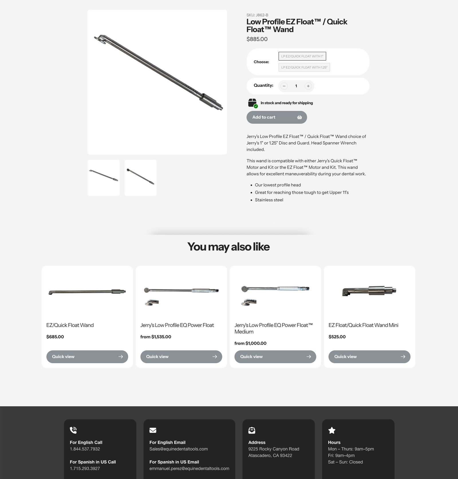
Highlights from the Redesign
Results & Outcomes
The project reached the internal review stage prior to launch, where the team began final checks on content accuracy and style consistency. Although the site had not yet gone live, the completed design work set the stage for a clearer, more modern, and more usable ecommerce experience.
- Improved clarity in category structure and site navigation.
- Updated, consistent visual styling applied across key pages.
- More approachable presentation of a highly technical product line.
Responsibilities & Contributions
I led the design and front-end implementation of the new site, collaborating closely with internal stakeholders to prioritize features and refine the navigation.
- UX audit of the existing site and content structure.
- Wireframes and page-level layout exploration.
- Visual design and component styling.
- Implementation within the Shopify Impact theme.