Project Summary & Goals
Novara Surgical Technologies is a new MAI Animal Health brand created to support veterinary teams as they adopt advanced surgical systems. At the start there was no logo, visual system or site content, only a working name, a high-level product vision and a desire for a brand that felt modern, precise and dependable.
Through working sessions with key stakeholders I distilled the brand into five pillars: Quality & Innovation, Domestic Support & Service, Education & Training, Premium but Accessible and Growth-Ready Solutions. Those principles became the foundation for the logo, visual language, launch landing page and introductory flyer.
- Express quality and innovation with an advanced yet approachable visual system.
- Make domestic service and support a visible part of the brand story.
- Put education and training at the center of the promise rather than in the fine print.
- Position Novara as premium but accessible and ready to grow with veterinary practices.
Starting from a Blank Slate
Unlike a refresh this was a true zero-to-one brand. Novara needed to feel distinct inside the MAI portfolio and different from generic equipment catalogs yet there were no finished products available for photography or detailed specifications. The launch site had to speak confidently about the future without overpromising features that were still in development.
- No existing logo, color palette or messaging to build on.
- Need to differentiate from other MAI brands and commodity suppliers in the same space.
- Communicate a roadmap of advanced surgical systems before product pages or imagery existed.
- Balance precise language for surgeons with clear high-level benefits for practice owners.
Designing a Lean, Story-First Launch
Since a catalog didn’t exist yet, the objective wasn’t to create a full ecommerce site. Instead the launch centered on a focused, story-first approach: a landing page that delivers a clear value message and walks users through the five pillars behind the brand, paired with an About page that expands on Novara’s identity, purpose and future product direction.
The structure is simple on purpose. It gives the team a clear narrative for early conversations now and it sets up a framework that can grow into a full Shopify site once product lines, training programs and case studies are ready.
- Hero section that states who Novara is and why the brand exists in one line.
- Scannable blocks that translate each of the five brand pillars into plain language.
- Preview space for future product categories without locking in specific SKUs.
- Navigation and page structure designed to expand into a larger site with minimal rework.
Premium, Technical and Approachable
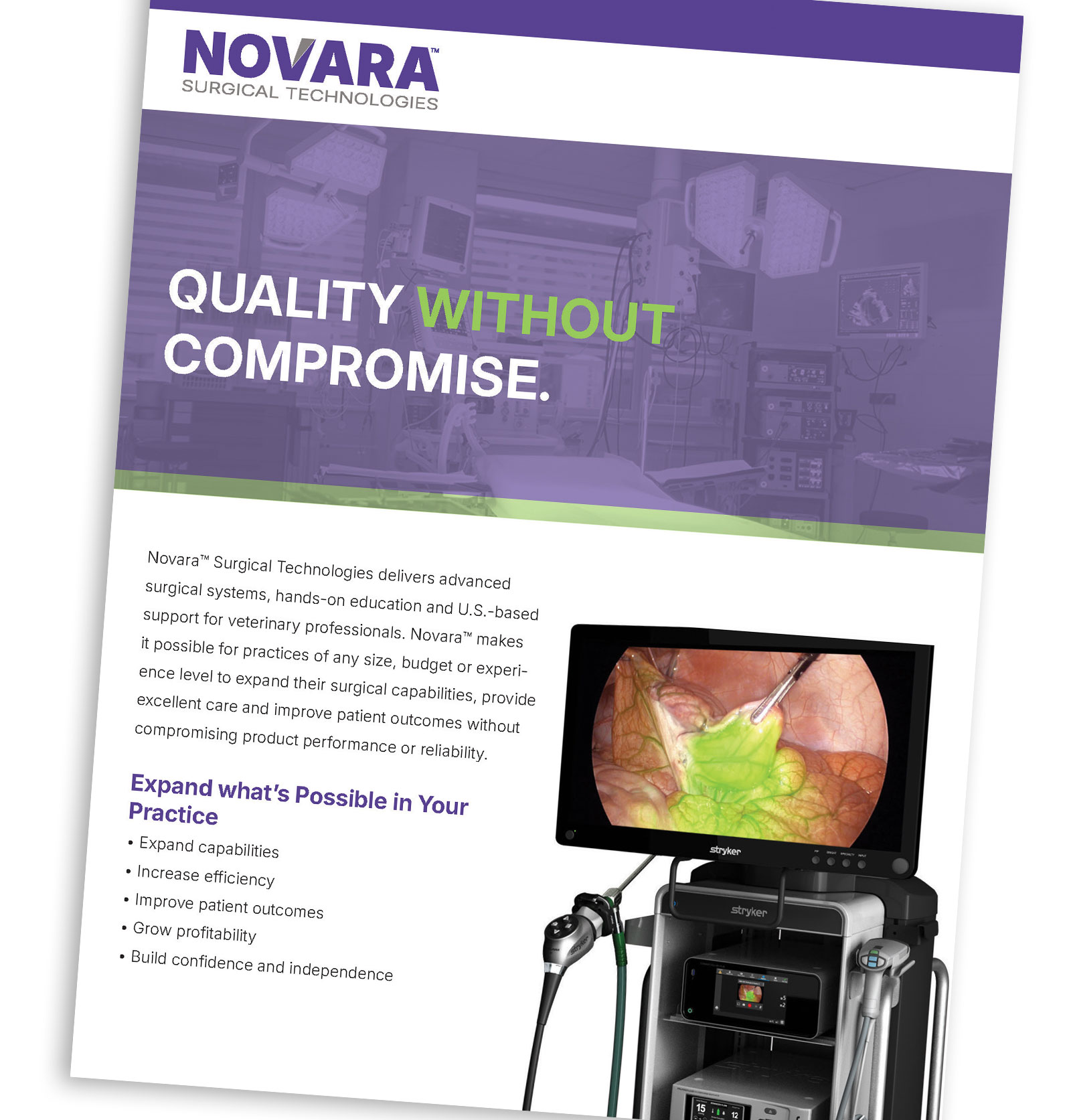
Visually, Novara needed to feel like an advanced surgical partner yet stay approachable for teams who are still building confidence with new procedures. The identity system pulls from the mood board directions of precision, calm focus and accessible sophistication.
- A custom wordmark and symbol that feel engineered and precise without becoming harsh or overly aggressive.
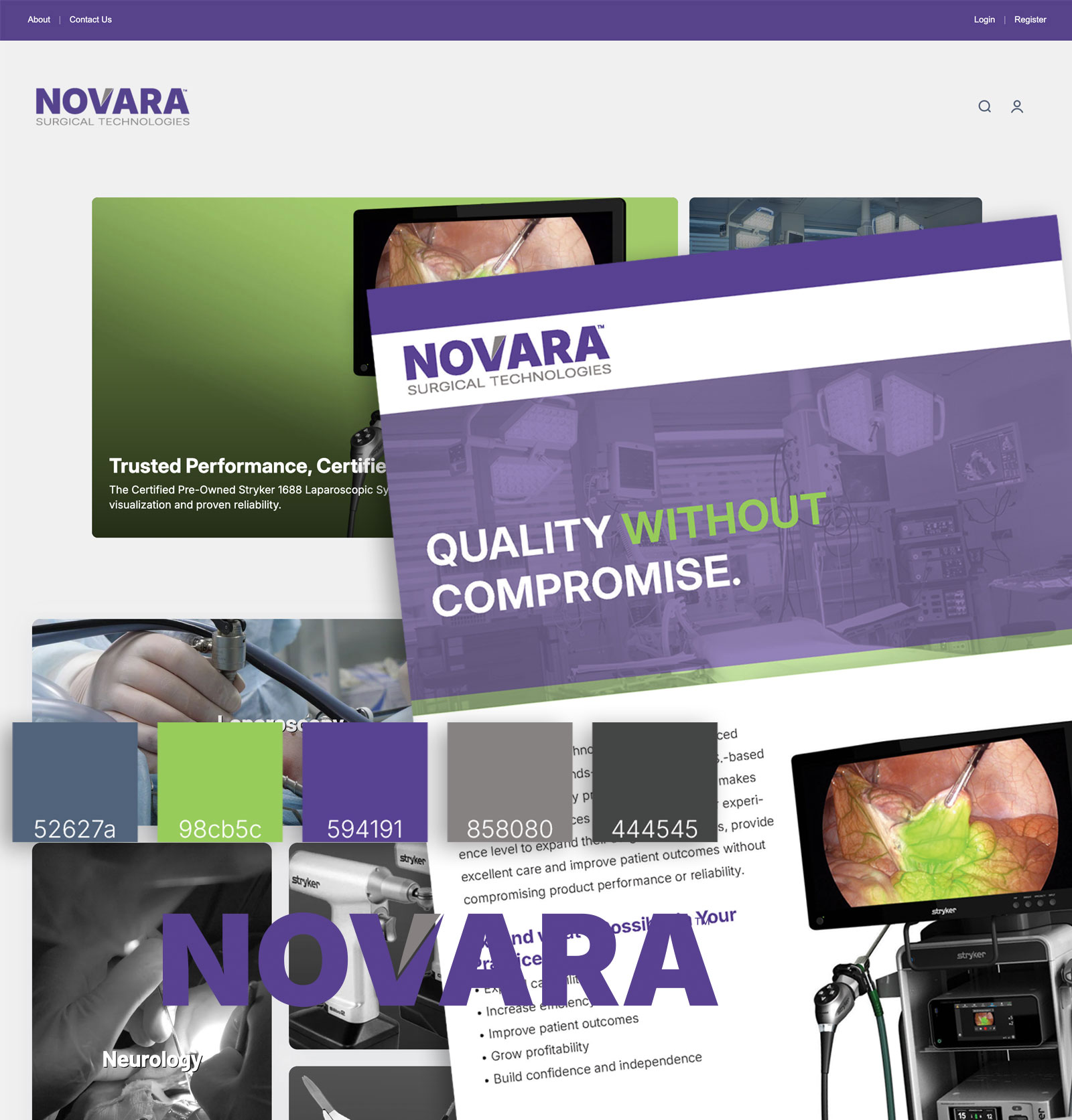
- A premium color palette anchored in royal purple and charcoal with a single accent color for calls to action and key highlights.
- Typography that pairs a strong, modern sans serif for headings with a clean body face for legibility across web and print.
Applying the Novara System


Outcomes for the Novara Brand
Because Novara launched while products were still in development the initial success measure was clarity, not conversion. The new identity and launch materials give the team a shared language for describing the brand and a concrete presence they can point to as they talk with early partners.
- A cohesive identity system that works across web, print and future product materials.
- A simple launch site that sets expectations now and can grow into a full Shopify experience later.
- Stronger internal alignment around the five brand pillars that guide future decisions on products, training and messaging.
Responsibilities & Contributions
I led the creation of the Novara brand from a blank page, from early stakeholder conversations through logo design, visual system and launch-ready web presence.
- Facilitated discussions with key stakeholders to define audience needs and brand positioning.
- Distilled input into the five guiding brand pillars that anchor all messaging and visuals.
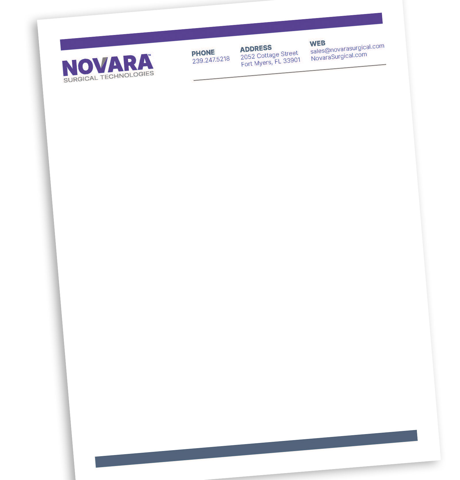
- Designed the Novara logo and core visual language including color, typography and layout rules.
- Planned and designed the launch landing page and About page within the Shopify Impact theme.
- Built the site front end and designed a matching launch flyer for sales and events.
